
Predicting Hospital Readmission Rates For Diabetic Patients – Part 2
This blog is a continuation of my previous blog, which was about my first foray into using machine learning (ML) platform to analyze medical data. I am a biologist by training and was very intrigued by the different ML algorithms available on ScoreFast(™) platform. ScoreFast™ was easy to use. I used four different classes of algorithms available on the ScoreFast(™) platform to build models, with a publicly available health care data set, to predict hospital readmission rates for diabetic patients. The goal was to build a predictive model, with the data set, that can predict which patients will be readmitted to the hospital within 30 days of being discharged after their first hospital admission. During the model analysis for the previous blog, we realized that the predictive quality of the models were not very robust due to the poor quality of the data.
Goals for this project are:
- Explore ideas for data cleaning and see if we can improve the robustness of the model’s predictive quality. Although we had done some data cleaning for the first study, this time we wanted to explore more ideas.
- In the earlier blog, we had looked at AUC (area under curve) to determine strength of the predictive models. This time we will compare precision/recall to determine the model quality. As discussed in the blog, the area under curve (AUC) of the different models were similar (0.61-0.65). However, the precision was not good. In this use case, the goal is determine if a patient will be readmitted to the hospital or not. So, the correct metric to measure the efficacy of the model is to look at the precision and recall. Precision gives the measure of how good we are able to predict if the patient will be readmitted. Recall tells us the patients which we missed to predict correctly. Going forward, we will use precision/recall values to determine the quality of model.
When the models were scored with out of sample data (the same data used in the previous blog, the V1 model), the precision and recall were low as shown below.
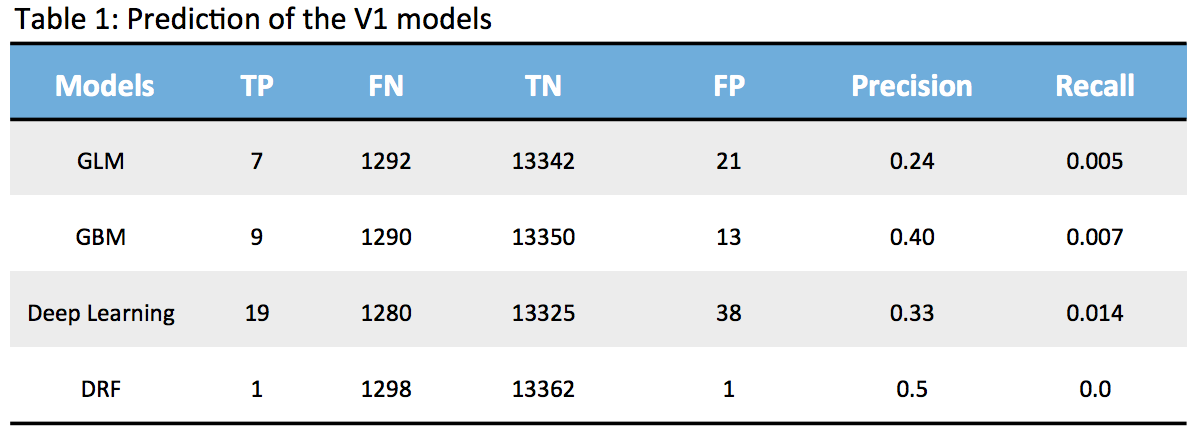
None of the models are strong since the True Positives (TP) are very low and False Negatives (FN) are quite high which means we are unable to detect patients who are highly likely to be readmitted. So, my next exercise is to look at how we can improve the model based on my learnings so far. I am using this exercise as a step by step process to learn and share.
For the previous blog (blog), we had done some data clean-up:
- Ignored encounter id and patient number, since these were not relevant to our study.
- About 52% of the data had a value in the ‘medical specialty’ feature column, so we had added “Unknown” to the empty data points and renamed it as “physician specialty’
- We had transcribed the icd9 codes in the diagnosis feature columns (diag_1, diag_2, diag_3) to their corresponding descriptions and renamed them (ic9Groupname, ic9Groupname2, ic9Groupname3). ic9Groupname is primary diagnosis, ic9Groupname2 is secondary diagnosis, and ic9Groupname3 is additional secondary diagnosis.
As mentioned earlier, one idea is to see if we can look at the data again and determine what additional steps (feature engineering) can we do to improve the quality of data. So, after doing some reasearch and additional understanding of data, we did the following steps to clean the data and see if the models will improve.
- We ignored max-glucose serum feature since less than 5% of patients had the data.
- We ignored the individual medicine columns except insulin (insulin was taken by 51% of patients and rest were taken by less than 2% of patients).
- We ignored the “medical specialty” column since we already had the data in a newly renamed column “physician specialty” (discussed earlier).
- We ignored the “encounter id” and “patient no.” feature columns, since these were not relevant to our goal.
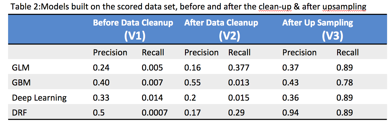
When the models were scored after the data clean-up, the precision improved but recall was still low as shown in the Table-2 below. This was public health data and so it was not possible to do any other data enrichment.
Since we are using binary classification, we took a look at both positive and negative sample ratio. The data is quite imbalanced with only 9% samples with readmitted=1 and rest of 91% with readmitted=0. There are multiple techniques one can take to solve the class imbalance problem, we decided to go with the simple route of adjusting the over and undersampling and see if it helps to improve the precision. We upsampled the positive samples (readmitted=1) by a factor of 3. The precision and recall improved significantly after we upsampled. The DRF model seems to be the most robust of the models which was quite interesting because it did not do well before the sampling (not sure why, need to talk to Data Scientists to understand better ).
The models were scored with a out of sample test dataset on V3 models, similar to what was done in previous blog on V1 models and discussed in Table-1 above. The results are shown in Table-3 below.
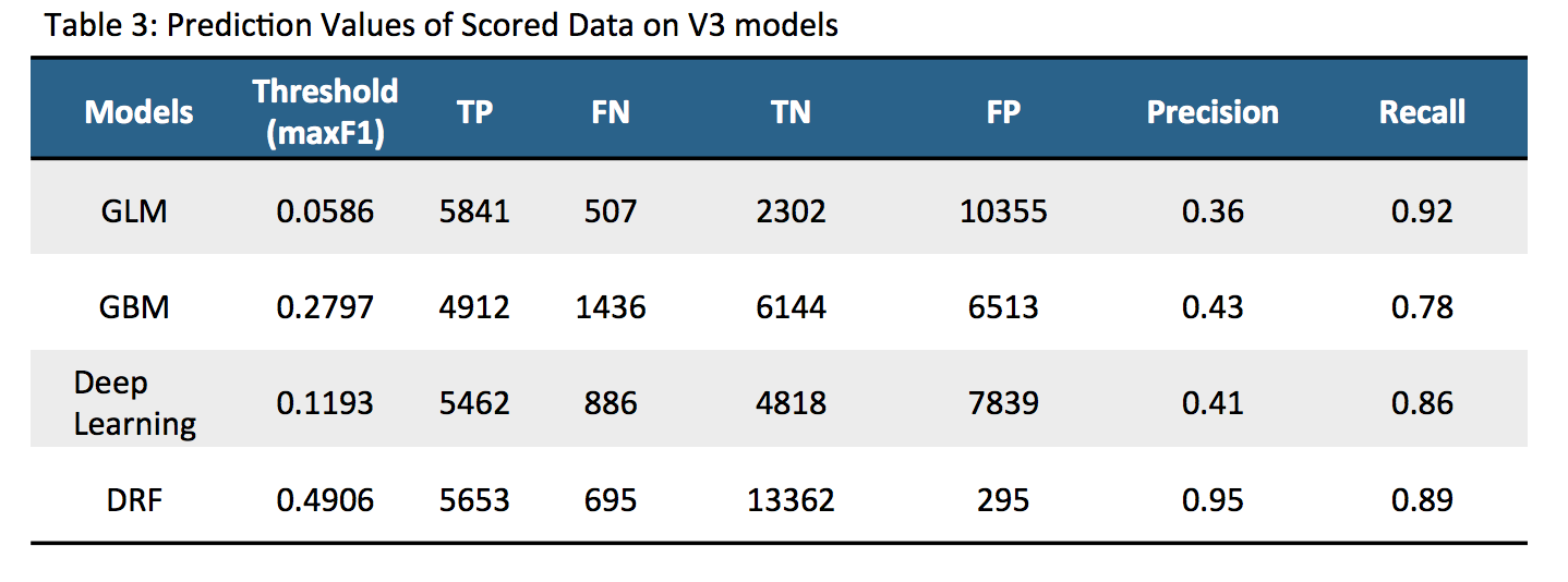
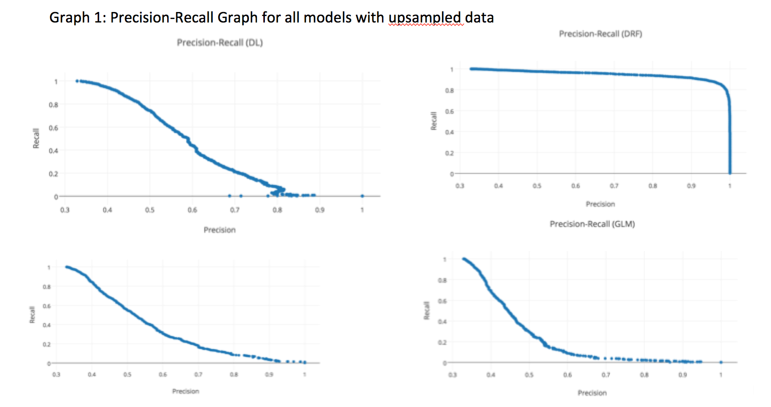
The above table clearly shows that after upsampling, the predictive nature of the models improved significantly. After data cleanup and data upsampling, the precision/recall improved significantly for all models. We can vary the threshold values of the model to see how it affects the precision/recall. We decided to see how varying values of the threshold could change precision/recall on the four models as shown in Graph-1 below. Each point represents 3 things; precision, recall and a corresponding threshold for the model. Depending upon the requirement, the threshold can be tuned to get the optimum results. The DRF model has a more stable precision and recall graph compared to the other 3 models.
So far, we have looked at how to build a better predictive model with the publicly available health care data. We were able to achieve that with various techniques. A physician/medical insurance personnel will be interested to look at the important variables driving the hospital readmission rates. Since V3 DRF model was the most stable model, for this data set, we decided to focus on the scaled variables of this model.
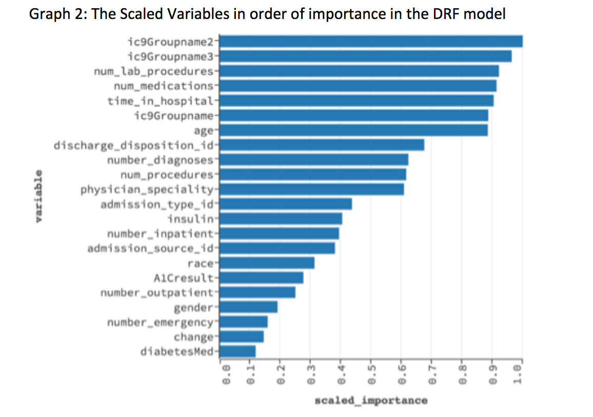
The above graph shows the scaled important variables as picked up by the V3 DRF model. The top 5 variables are: 1) ic9Groupname2, which is secondary diagnosis (2) ic9groupname3, which is additional secondary diagnosis (3) Number of lab procedures (4) Number of medications (5) Time in hospital.
The average cost of stay in hospitals in US is about $2000/day (link). A physician/medical insurance personnel can analyze the top variables picked up by a predictive model and decide how to use the data to prevent readmission of patients and also to reduce hospital stay. This will have significant impact on cost to the hospitals. Data analysis using predictive models can be used for preventive measures or even as a diagnostic tool in a healthcare setting.
Summary
Data is key to a good model and enough effort must be given to clean the data and feature engineering. However, ability to build models and see the performance in a easy to use platform is also important as here. ScoreFast(™) was an easy platform for me to understand how I can use machine learning to life science applications. This project taught me a lot on what it takes to build a predictive model and the nuances of building predictive models, interpreting results, defining metrics and finally doing data wrangling to improve the models. Domain expertise is a critical part of this as the semantics of data needs to be understood to make the models work. I look forward to continuing my exploration of health related data in the ScoreFast(™) system.
Acknowledgement: I would like to thank Prasanta Behera for helping me guide this project and the ScoreData team on giving me feedback on the blog.